Spotlight – Time for an Update and Re-design
Re-Design and Layout Changes = A Wonderful Kitchen Remodel
These Tempe homeowners had a very outdated kitchen, un-utilized areas that could be used for extra storage space, poorly planned door & window locations, and an area of arched walkways that created a “closed-off from the rest of the house” feeling for the kitchen and family room.
Once we began surveying this Tempe Kitchen Remodel, we quickly saw that this project was about creating an open-design living space, and making better use of the space the homeowners had to work with. As such, the original footprint was scrapped, and we focused on better space planning and layout for the kitchen and breakfast nook areas, updating all of the cabinets, countertops, appliances, and flooring, as well as focusing on maximizing cabinetry and countertop space – as well as the feasibility of removing those pesky arches blocking the view of the kitchen.
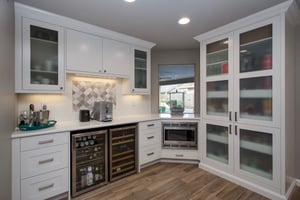
The original kitchen layout included a breakfast nook area that was simply too small to put a kitchen table and chairs in, as well as an exterior door that would swing in-ward to the breakfast nook creating even less useable space. As such, the space was left unused for many years. To solve this issue, the exterior door was relocated to a new location in the kitchen (installed to swing outward), windows removed, and new cabinets installed in the breakfast nook to create a “coffee bar” area which included new pantry storage as well.
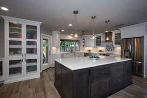
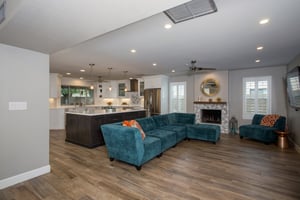
Our homeowners loved to sit at the kitchen island to eat and socialize, but also enjoyed watching the large TV in the adjoining family room area. This complete kitchen remodel created the opportunity to re-plan the island layout; so it was enlarged, turned around 180 degrees, included storage cabinets and pull-outs on both sides of the island. But also included a recess area that allows the 4 family members to sit at the island and watch the TV across the room while enjoying a snack or dinner together.
To determine if the arched walkways could be removed, we cut a couple ‘exploratory’ holes in the drywall to see if we were dealing with a load bearing wall or not. The good news was the wall was not, and the arches could be removed to create the “wow” factor the homeowners deserved as you entered the house. We did, however, uncover a surprise during demolition of the arches; there was plumbing buried in the wall from an old wet bar that was previously there. Some concrete had to be removed, and plumbing lines capped and re-routed to create a clear walkway.
Here are some other highlights from this Tempe Kitchen Remodel project:
- Engineered Quartz Countertops in White, with a “Crescent” edge detailing
- The perimeter cabinets are white, while the island cabinets are a beautiful rough-sawn oak which adds another layer of texture to the kitchen
- For the backsplash, the homeowners wanted something that wouldn’t go out of style, but also wanted to add a touch of something that nobody else would have. So the backsplash consists of 3″x6″ white subway tile, but also includes a decorative mosaic inlay at the cooktop, and coffee bar areas.
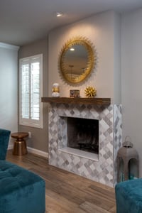
- The same decorative mosaic tile was used on the fireplace front, along with a new mantle, and removing the hearth to create more space in the family room.
- New wood-look porcelain tile flooring was installed throughout the family room, kitchen, laundry room, and powder bathroom areas. Which originally consisted of 2 different types of flooring (wood & tile). Utilizing one consistent tile throughout the area, now makes the rooms feel larger and there’s a better “flow” through the rooms.
- New LED under-cabinet lights provide a warm ambiance to the kitchen at night
This Kitchen Remodel project became about remodeling some of the adjoining areas too.
- New cabinets were installed in the laundry room to better utilize the available storage area
- The door to the powder bathroom off the family room was relocated to a different location to provide more privacy, and also became a pocket door to save square footage in the bathroom.
- The fireplace got a face-lift by smoothing out the rough texture finish, and applying the decorative tile and mantle mentioned earlier.
- We also used this opportunity to relocate those pesky TV/Cable wires that you normally see running down the wall a credenza. The components were relocated to the back side of the wall, wires hidden within the wall, and the flat screen can now be enjoyed without the eyesore of those dangling wires.
You can find some before/after pictures of this Tempe Kitchen Remodeling Project Here
Are you embarrassed to entertain because your Kitchen is outdated, not functional, and in need of some space planning and layout help? Learn more about our Team, then fill out the form below to schedule a time we can discuss your design/build kitchen remodel project.


